.png)
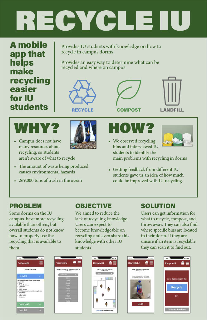
RecycleIU is a conceptual design of an app my team designed with the motive to help students at Indiana University recycle more efficiently. This project presents an approach to solving problems faced during a user’s recycling experience by introducing an app that makes recycling easier.
Challenge
Design a new app that helps students recycle better to help improve every students experience with recycling.
Solution
Interchangable Roles
UX, UI Designer
Time
3 months (Course Schedule)
Tools
Figma, AdobeXD, Canva
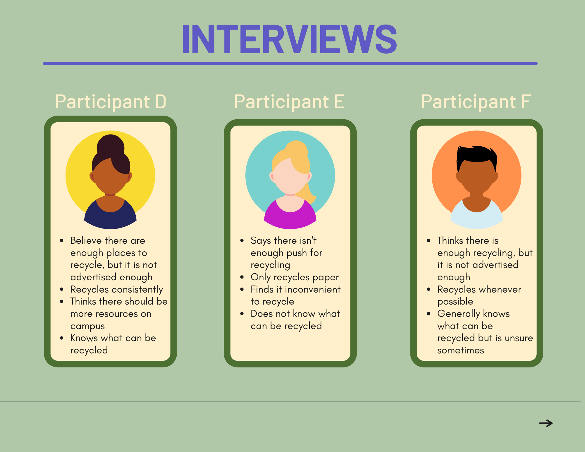
To understand what students look for when tying to recycle, my team went out and conducted interviews from IU students
and observations on different recycling bins on campus.
Through my interviews and observations, I wanted to understand:
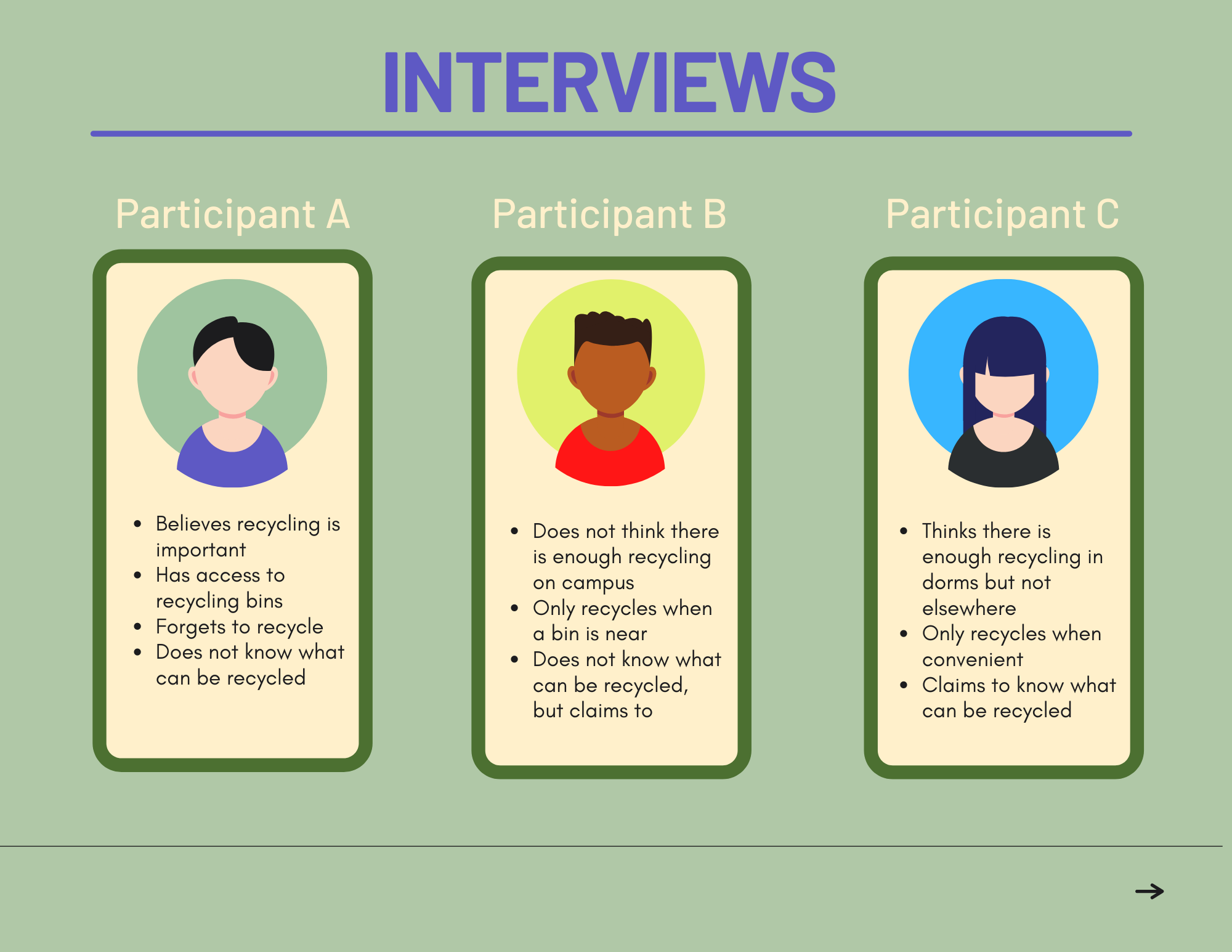
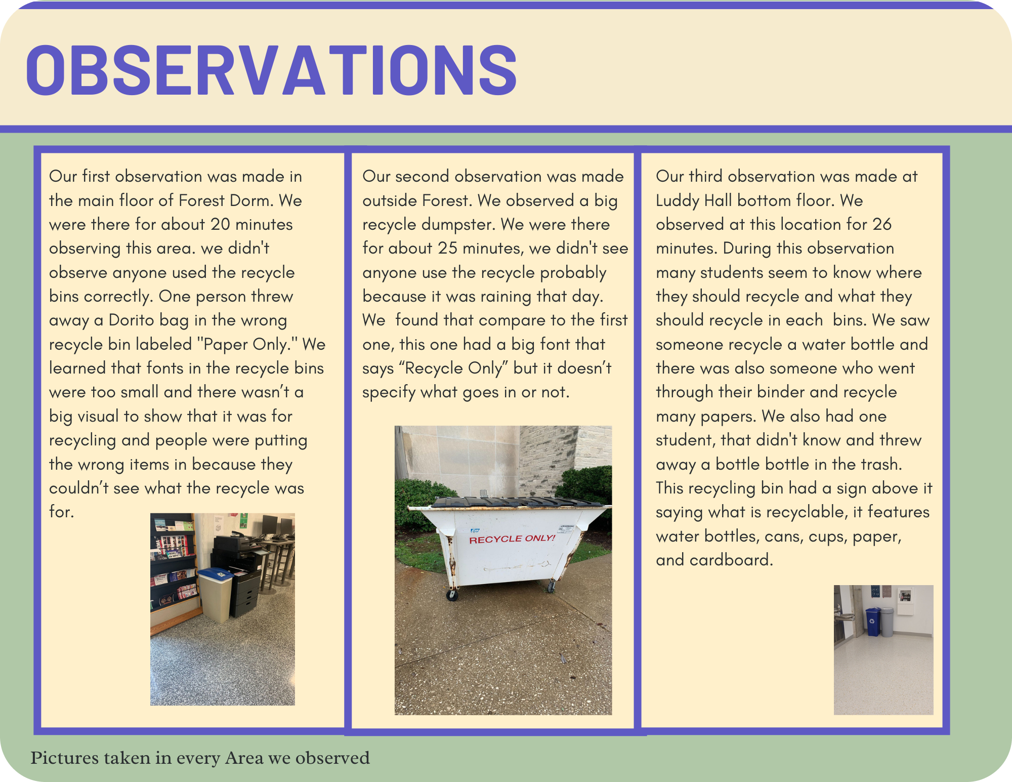
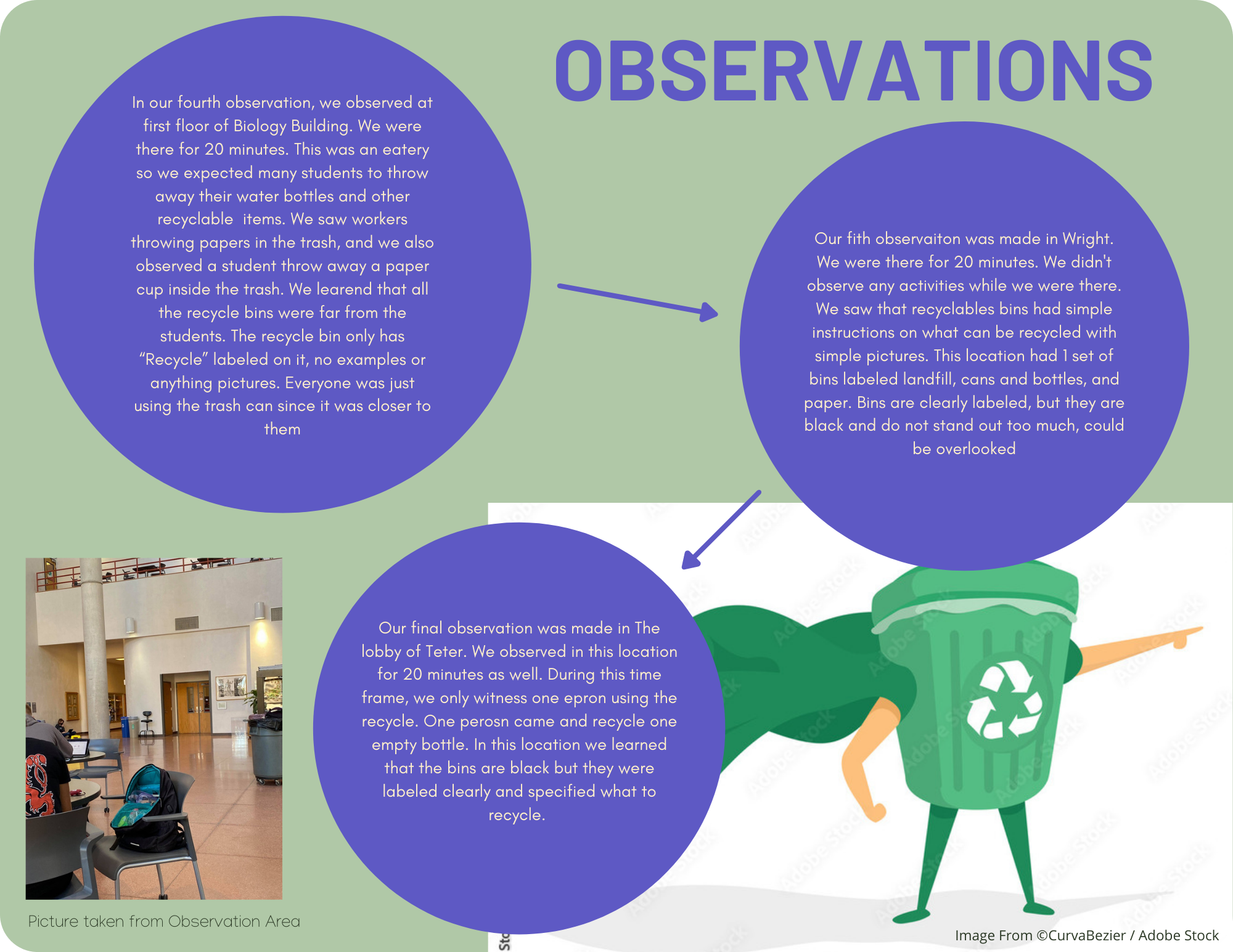
For our observations, our team went out to observe different recycling bins in various locations on campus. We did
this to gain a greater understanding from the point of view of the students attempting to recycle.
Observation Method: We took organic field notes on how our target group interacted with the recycling bins in their dorms.
Why:
-Find Key Findings while observing students recycle
-To better understand the need for improvement
- Review our notes and time logs to find more efficient ways to spend less time at the recycling bins
Key Findings:
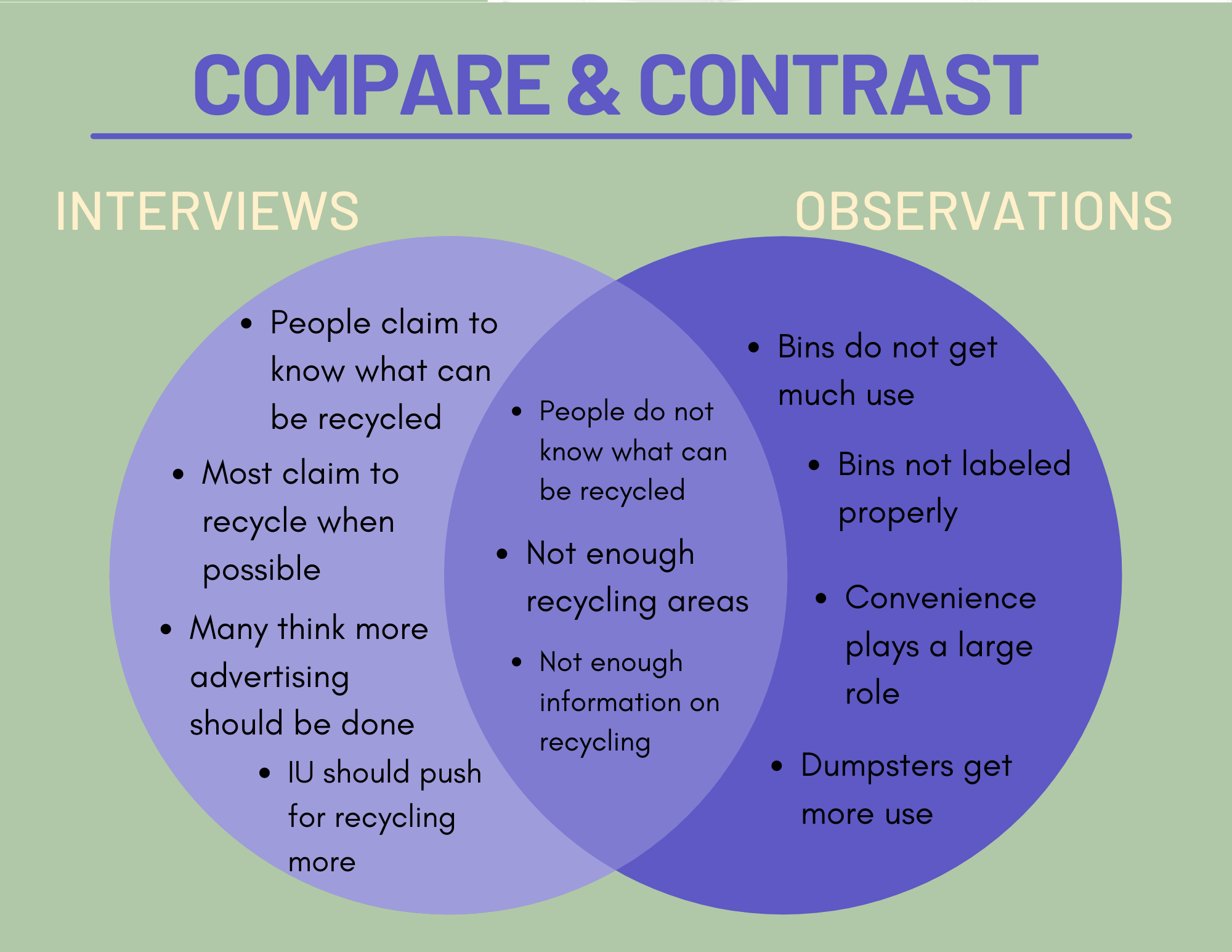
To synthesize our findings from testing, we took our organic field notes and notes from interviews to create an affinity map.
This helped us better digest the different patterns observed while testing and pin point where revisions need to be prioritized
to improve the usability of the design.
You view the Miro board link to the diagram Here.
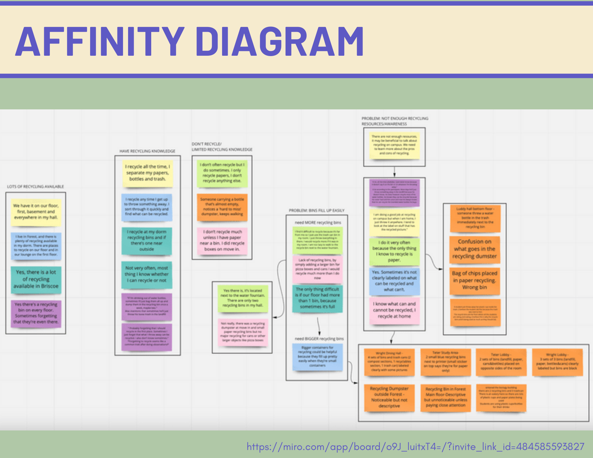
Based on the prominent patterns observed related to the users' pain points, we were able to identify the insights
and findings to help lead to specific design recommendations.
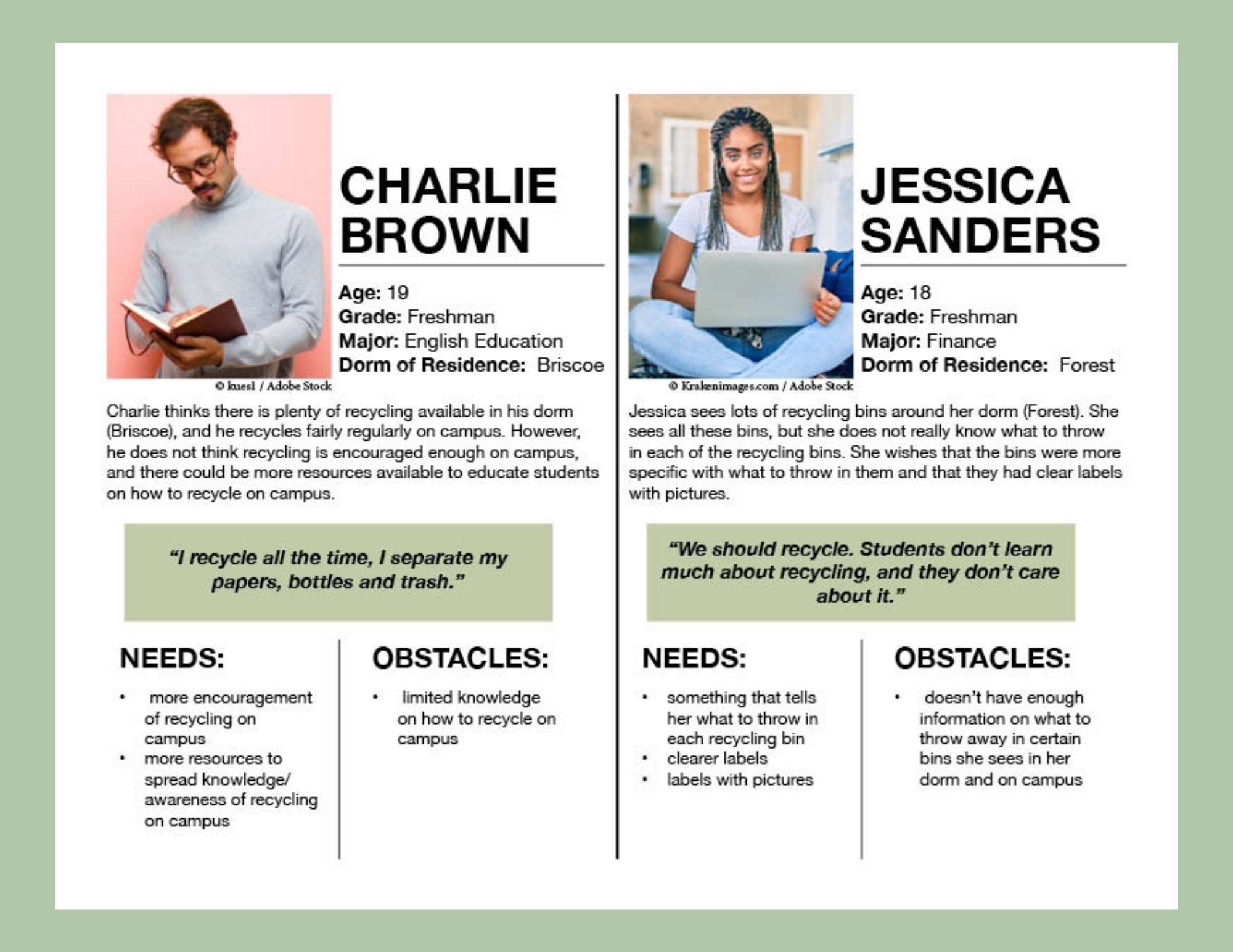
To guarantee that our decisions moving forward in the process
are user centered, we wanted to have a clear understanding
of who RecycleIU users would be. Gathering together what we
learned from patterns from out affinity diagram, we created
2 different user personas to represent the difficulty of recycling
at IU.
We started our brainstorming process by having each group member come with their own concept design.
We then received feedback on these concepts to help us narrow down which concept we would like to progress with.
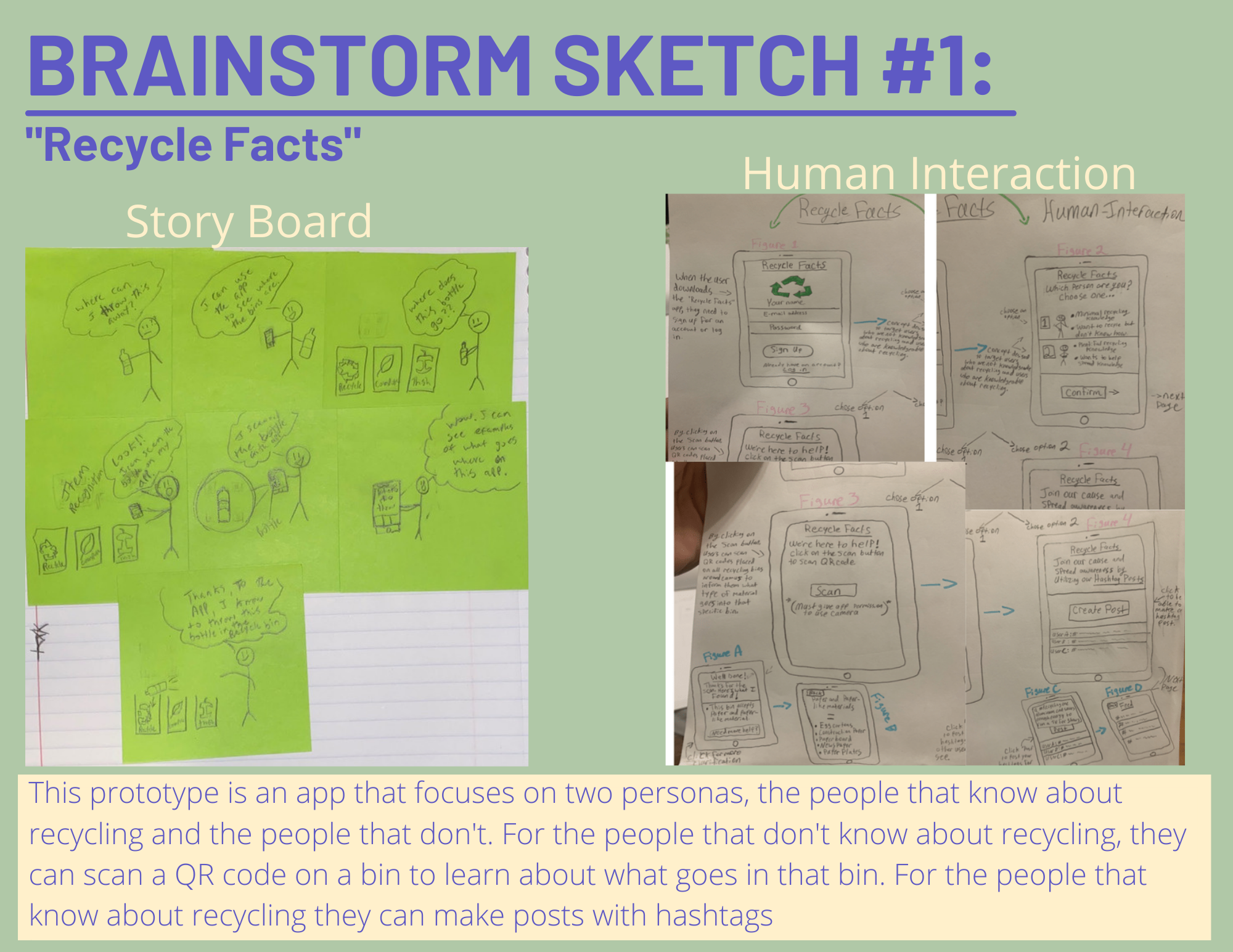
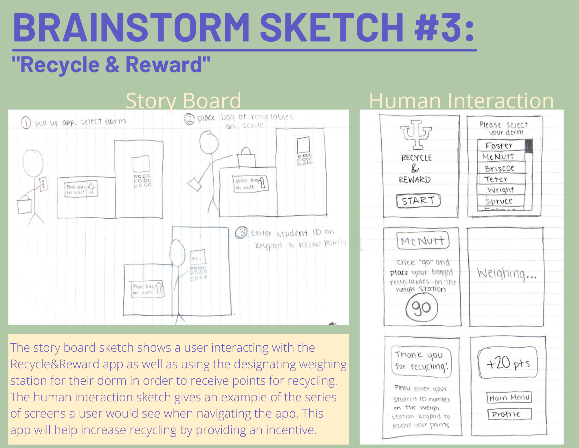
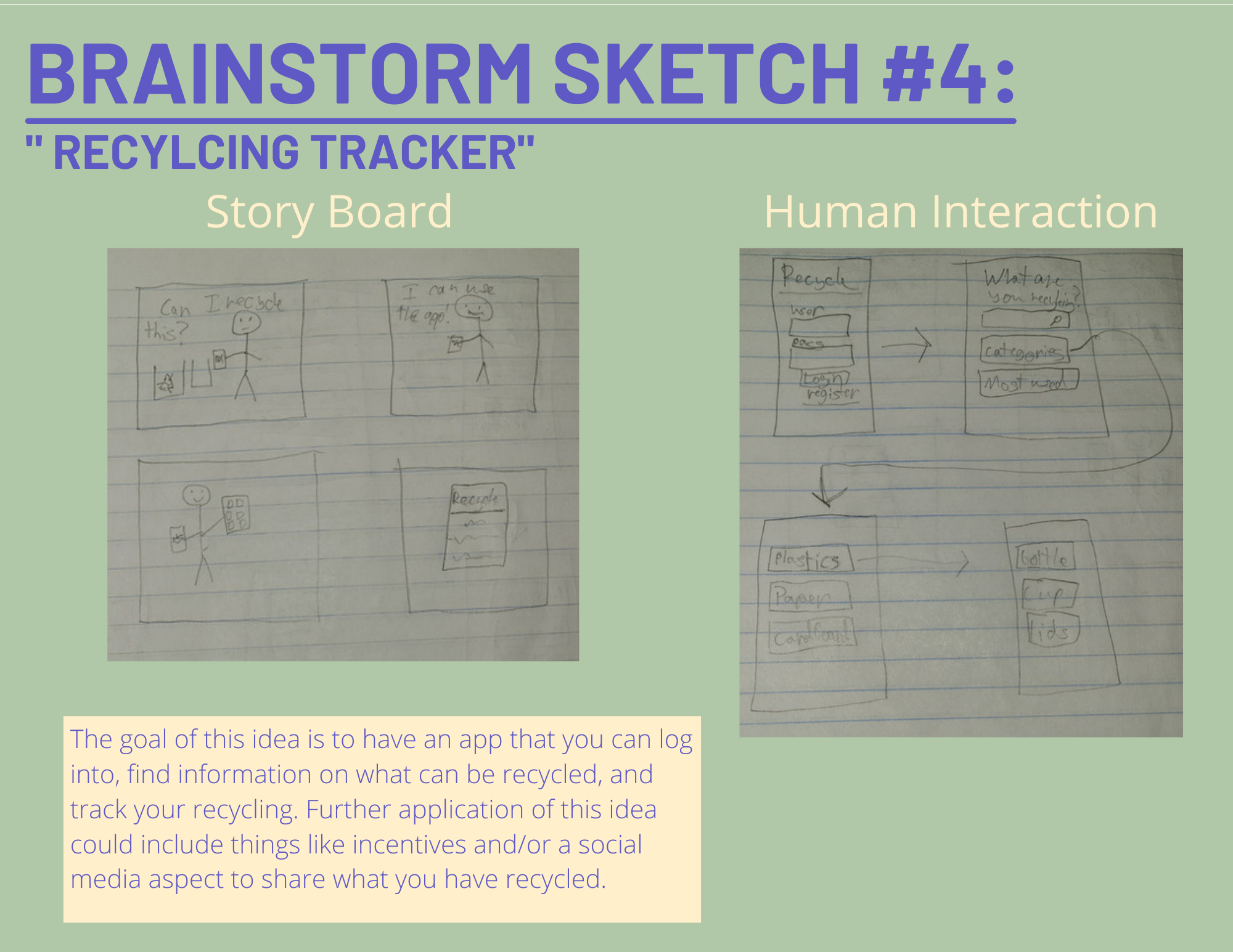
Our team decided to chose brainstorm sketch 1 to progress with. Based on our
feedback from Instructors and students, this concept showed more promise to
mobilize and design new features to add on to what was originally
sketched. So for our iteration-low fidelity, we added some features
you can read below:
.png)
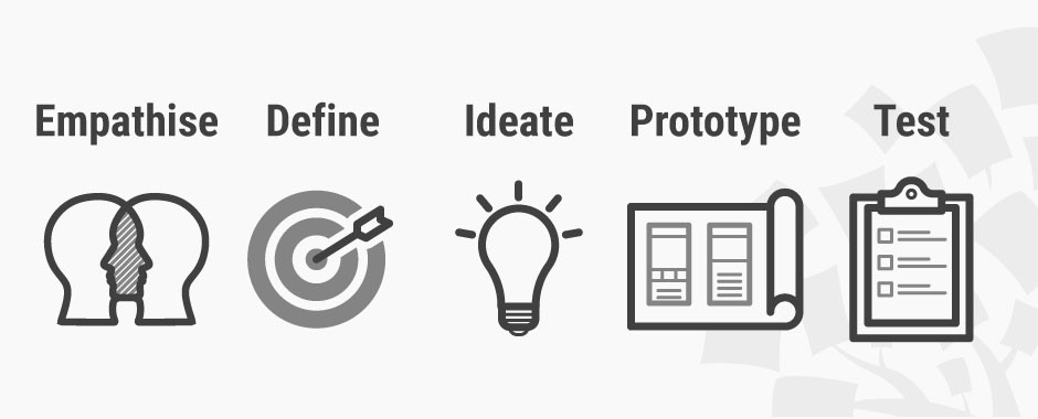
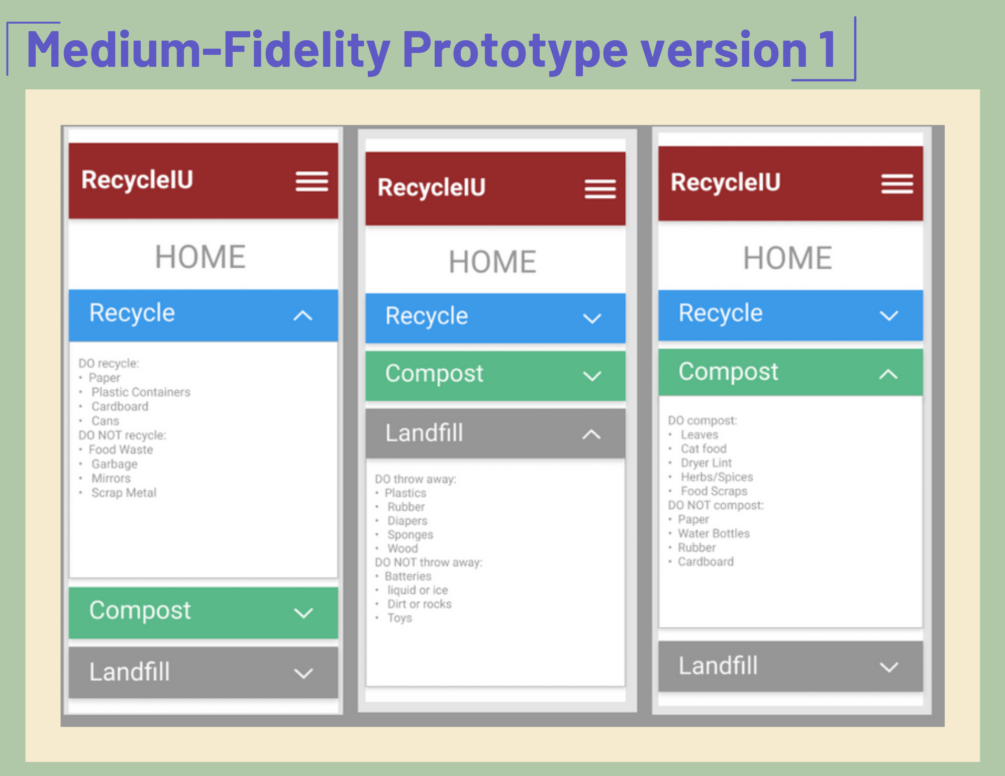
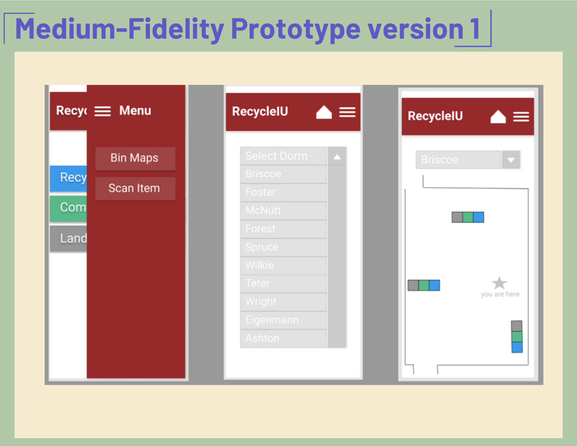
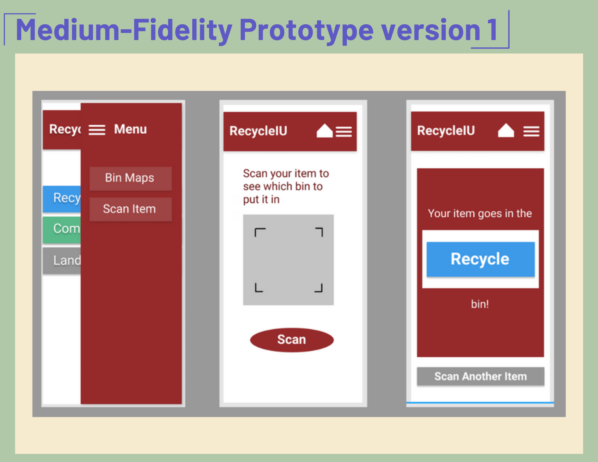
Now that my team has sketched out different concepts of sketches, we wanted to test the decisions we
made and ensure that the structure and flow of the app was intuitive for our users. Before working on the
visual design of the app, we wanted to first make sure that the design was functional. In order to do this, we
created a mid-fidelity prototype which would help us test the design on real users and make any priority revisions
before integrating the visual design.
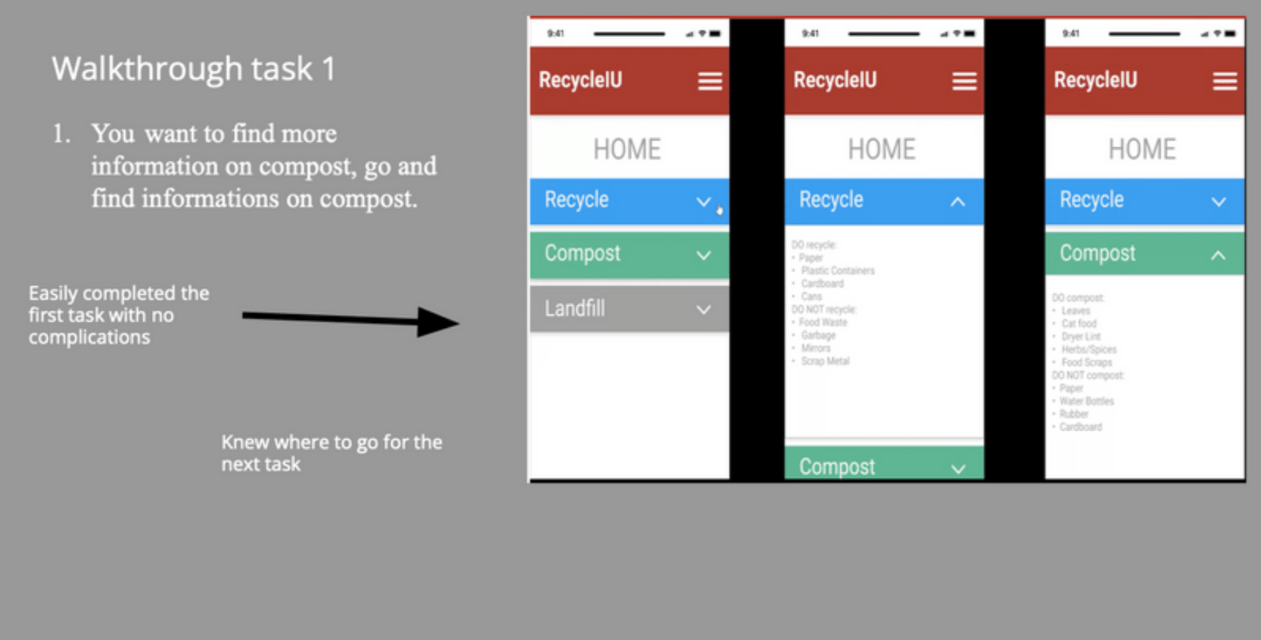
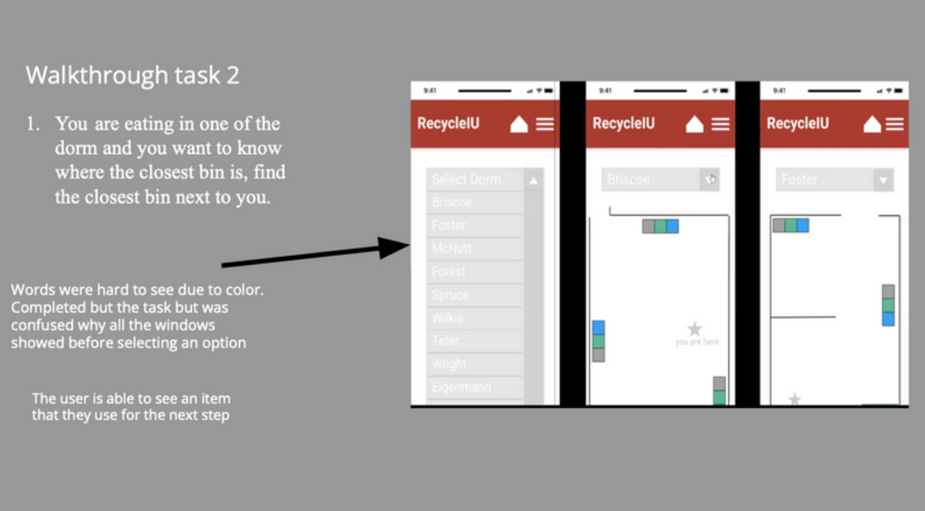
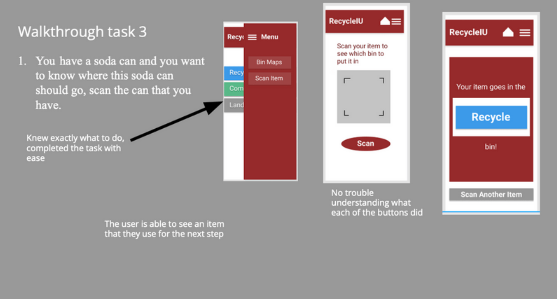
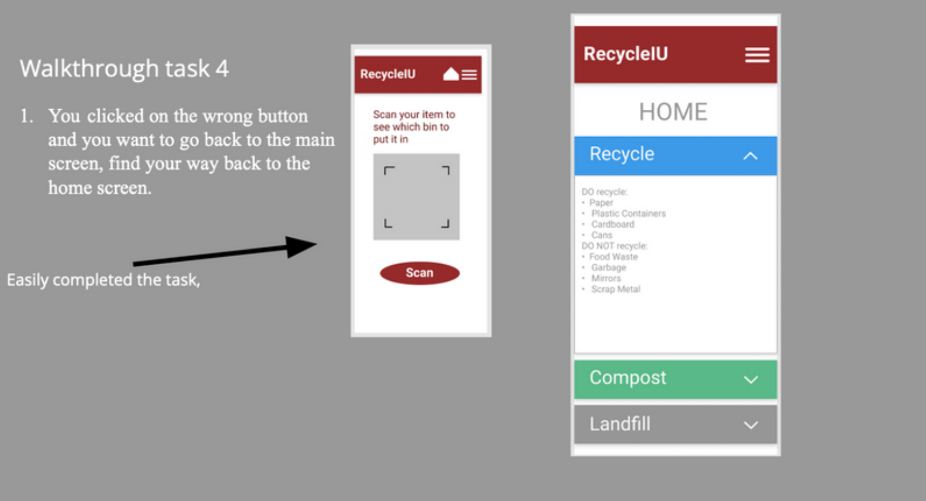
We chose to do a cognitive walkthrough for our app instead of the heuristic evaluation because our app had a lot
of features and buttons that the user needed to interact with. We wanted to make sure that the actions that the user
is taking will lead to the next correct step. We wanted to also know that the buttons and features were being understood
by the user and that each function did what it was supposed to.
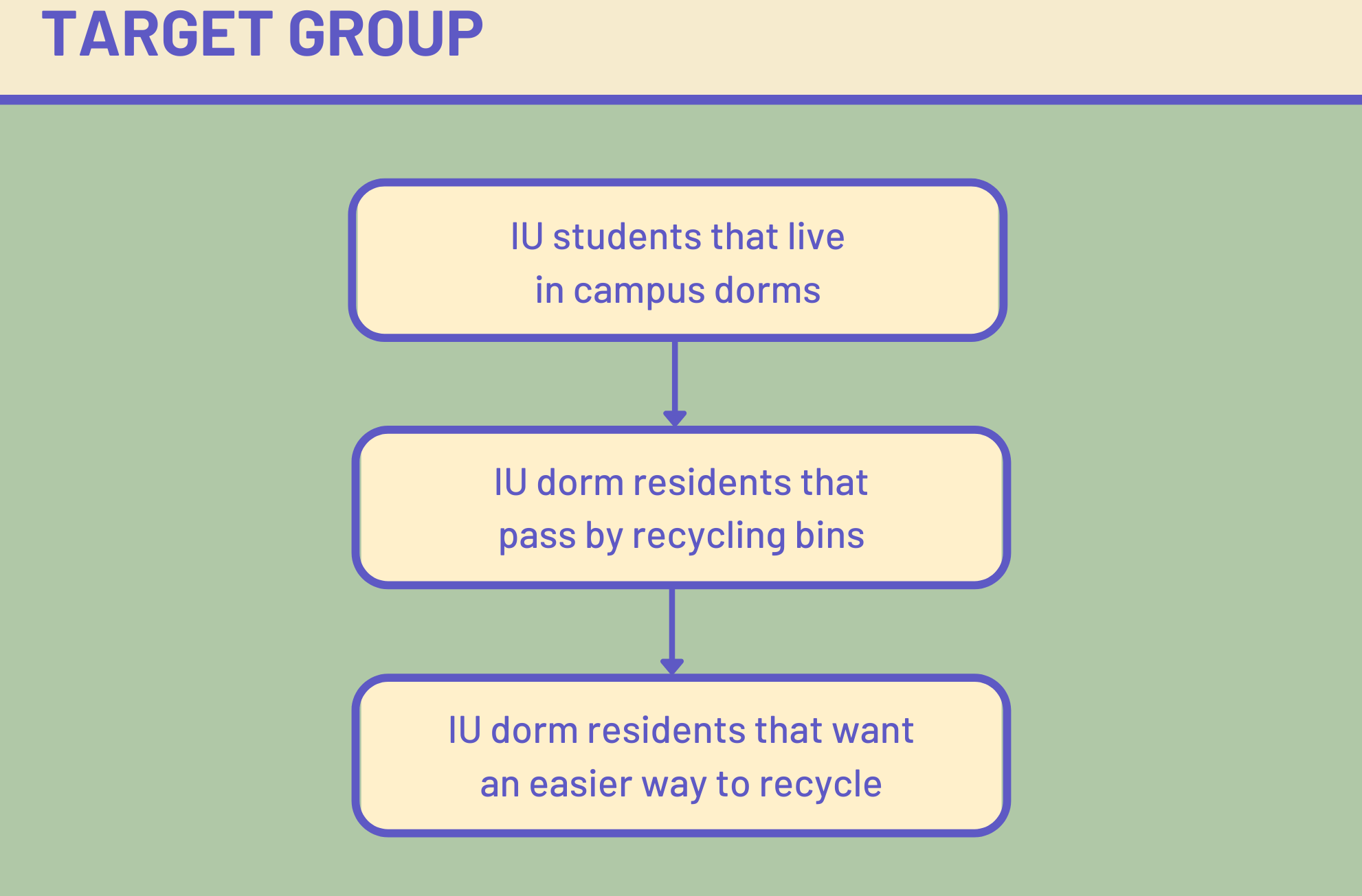
Our “typical user” are students that go to Indiana University Bloomington and are living in campus housing or dorms.
They are students that want to know more about recycling and to be able to tell the difference between landfill, recycle
and compost. They also want to know where the closest bins are located around them.
For usability testing, my team conducted in person walkthroughs where we had our selected users complete
the tasks outlined above inside of our Figma prototyping tool. The users were asked to share what they were
doing, thinking, and feeling while interacting with the prototype and trying to complete the tasks presented to them.
Overview:
For the most part our participants were able to easily complete all our task. Judging by our participants thinking
aloud, we noticed it was easy for them to navigate around the app and there weren’t many buttons that were confusing
to them. Participants did not find it difficult to navigate from page to page. Although they were able to complete these
task, there were some small problems that they ran into. These included stuff like how the screen already showed all the
available options for the maps before choosing them and the color of the fonts were hard to read.
Recommendations:
1) Make only one screen show at a time
2) Adjust fonts for better readability
3) Make the app look more appealing
4) Add guides or directions before every action to guide the user
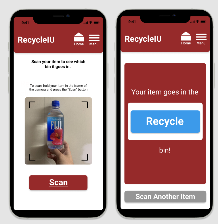
Absorbing our recommendations and feedback received, we were able to transfer our mid fidelity into this final
fidelity prototype with proper iterations made. Users can open the app for general recycling information, view the
nearest recycling bins through the bin maps, or if unsure, can even scan the item which will output the designated bin
for that scanned item to be recycled in.

 View Final Prototype